Problem
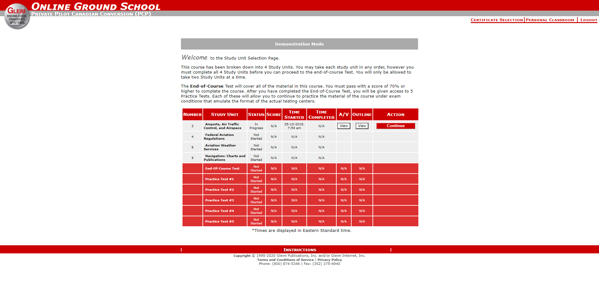
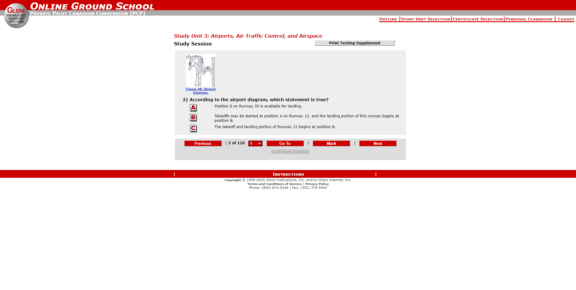
The previous exam review course for pilots, the Online Ground School (OGS), was in dire need of an update. The interface was at least 15 years old and wasn’t translating well on portable devices. The product owner for the review course was a certified flight instructor. This gave the team rich feedback and goals for the redesigned review course as well as easy access to active pilots and flight schools.
Discovery Phase
Combing through user feedback, we determined that the content, the quizzes and general pedagogy of the material was sufficient. The weakness in our review course was that the interface frankly looked like Windows 97 and our competitors had modern, sleeker looking courses. We interviewed several pilots, mainly certified Private Pilots, who represent the largest buyer of our online course products. We also spoke with a Flight School Instructor and got his insights into how they used the review course to educate their students.
Data Derived Goals
This project had strong goals we needed to hit. Initial data both pulled from current course usage and user interviews determined that the course should be optimized for tablet. The audience trended to be older, so accessibility was important when considering touch screen haptics, buttons, color contrasts and possible tablet screen variations.
The previous course was very outline format heavy with small red buttons that were difficult for older users to read and click with accuracy. Using Fitt’s Law for the updated interface, we opted for larger clickable buttons/elements/cards that also translated very well for tablets.
The updated quiz interface and overall flows were mapped out and iterated on continuously in workshop sessions for the first couple weeks.
When the paper prototypes were approved, the wireframes were given to the designer assisting me with the project.
Since the main flow of the course was the same, study > quiz > final test > repeat, stakeholders pushed not to have a prototype created and focused more on the interface.
The paper prototypes were passed off to a designer assisting me with the project. We met and iterated on the interface, while meeting periodically with the product owner over key touch points in the design.
When most of the production of the screens was complete, I worked with stakeholders and other key parties to tweak and finalized the updated course screens.
The main dashboard had to communicate a variety of statuses at the same time. There were multiple contingencies that could limit or lock in the user depending on where they were in the course. It was imperative that these limitations did not distract or confuse the user.
Each card, depending on what it represented in the course, had multiple states/indicators of it’s status.
Red was very integral to the course’s brand. The books were referred to as “the red books” in the pilot training community and the online courses had always been predominantly red. I tweaked the color to be a slightly darker, more accessible red.
The quiz interface was optimized to be very tablet friendly, with the most-used buttons placed in proximity to each other while also being large enough to easily press with a finger for tablet.
An emoji status tool was added as a feature for the update, so users could denote how they were feeling about a certain section of the material. This allowed them to return to material they were unsure of in the final stretches of studying before their exam.
The image tool was a large undertaking in the project, as the previous tool was very clunky and unintuitive. Images are sometimes needed to answer certain aviation questions, so a tool that showed the images clearly and allowed the user to edit, zoom, measure, etc. was very important in the update.
Study Units in the review course are large chunks of material, much like chapters. Each Study Unit houses anywhere from 3-20 sub-sections. These sub-sections each contain “study loops” of reading the material, then taking an interactive quiz and then a graded final quiz.
It was important that the user know where they are in the course at all times. There was a common scenario where a user would leave or pause their studies. If they logged out after a night of studying, they would be taken back to this screen to resume their studies.
The UI kit was created after we received final approval on all the key interfaces.
The most intensive part of the kit was the Image Tool’s elements and states. There were many tools that did aviation specific actions and I created icons to denote these actions clearly for students studying to be pilots. The icons were tested out of context with a small focus group and they were recognizable to participants.

Gleim Publications develops and distributes study and reference materials to help customers learn and understand Accounting and Aviation. Their mission is to maximize knowledge transfer while minimizing your time, frustration, and cost. They provide to accountants and pilots with easy-to-use, effective knowledge transfer systems. This stems from the company’s founder, Dr. Irvin Gleim (a prolific Professor of Accounting at University of Florida) having a passion for both accounting and aviation. He leveraged his self-study products to include pilot training as well.