Problem
Online review course purchases using mobile devices had surpassed those on desktop. It was imperative that the checkout be usable and optimized for mobile users. Another issue that needed to be resolved was placing better tracking during checkout, as well as updating the back-end code.
Discovery Phase
The discovery phase was limited for this project, given that there was no previous tracking or checkout analytics. We were, however, able to interview some customers. I identified the following goals for updates from customer feedback and chat logs. In addition to making a more mobile-friendly interface, the following goals were identified.
Additional Goals:
The wireframes and flow were straight forward given the available case studies on e-commerce checkout. Product owners were eager to update the checkout process, so the wireframe and paper prototypes were quickly approved.
A minor detail that was important to me was the icon associated with the secure checkout button. Previously, the secure checkout aspect of the cart was a two-paragraph explanation about our secure servers. It was verbose and raised suspicions in the users we interviewed, such as “Why are you are talking about your secure server so much, was it unsecure before?”. Taking a cue from large online retailers, I made an icon associated with the checkout button that made the user feel it was secure, without calling a large amount attention to it.
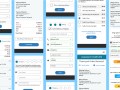
The cart UI had to be responsive, accessible and modern. Another unique aspect of the cart was that it served many different product lines. The cart was the same for customers purchasing from the Accounting and the Aviation e-commerce sites, both which had very different markets and brands.
The Accounting e-commerce site generated the majority of our business, so it’s color scheme was most prevalent in the cart. However, I did not want it only to be branded with our Accounting division, so I opted include elements of the Aviation brand as well.
Slightly different interfaces were made pending negotiations with the express checkout services.
The interface was designed to be mobile first. My research indicated part of our cart abandonments were due to mobile users trying to check out on their phones but hitting so many snags that they just left.
The interfaces were AA level of the ADA success criteria for keyboard navigation, color contrast, font and button size, landmarks, headings and more.
The checkout process was designed to be mobile first, then scaled up for desktop. A hard goal from stakeholders was to have no scrolling, if possible, on any check out page.
The interfaces were AA level of ADA success criteria for keyboard navigation, color contrast, font and button size, landmarks, headings and more.
Since the cart and checkout project was undergoing a major overhaul of the front-end, as well as the back-end, I worked closely with engineers to set up a proper UI color library. This is so they could implement css variables, laying the groundwork for proper dark modes and accessibility filters, etc.
During our big ADA push for the course (mentioned in this project), the UI color library served as the basis for those course fixes, because they were already AA level assessible.
#1, Visibility of system status of Nielsen’s 10 Usability Heuristics for User Interface Design was overlooked for the original checkout process, so that was one of my first and largest pushes with the clear steps atop the checkout process pages.

Gleim Publications develops and distributes study and reference materials to help customers learn and understand Accounting and Aviation. Their mission is to maximize knowledge transfer while minimizing your time, frustration, and cost. They provide to accountants and pilots with easy-to-use, effective knowledge transfer systems. This stems from the company’s founder, Dr. Irvin Gleim (a prolific Professor of Accounting at University of Florida) having a passion for both accounting and aviation. He leveraged his self-study products to include pilot training as well.